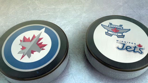
I’ve always enjoyed and placed a lot of emphasis on sports team logos. They seem akin to a coat of arms or a medieval banner. They become more than just an image in the center of the field; they become a rally, a source of pride and strength. So, with people as passionate as they are about their team, it’s important to get it right (looking at you, Buffalo Sabres… Hey, where’re you goin’ Tampa Bay Rays?)
Even as a kid, I got excited as teams would change hands or expansion teams were added to leagues. Not because of the effects it would have on the rest of the teams of the how the new teams roster would fill out or anything like that (I’ve never been one to follow sports that closely), it was because a new logo and brand would come to life.
The Jets name has been around for some time, in various forms. The Winnipeg Jets were first founded in the World Hockey Association, one of the few strong competitors to the NHL, in 1972. When the WHA inevitably folded, the Jets were still remarkably strong. The NHL absorbed the Jets in 1979 where the team enjoyed as well a run as could be expected. In 1996, with money being the deciding factor, the team had to move out of Winnipeg and became the Phoenix Coyotes, who still operate today. In 2009, True North Media optioned to purchase the flailing Atlanta Thrashers with intent to move the team to Winnipeg. With Winnipeg’s rich Canadian Air Force history, the Jets name seemed the only choice.
The design mainly plays off of the Canadian Air Force’s rondelle medallion that is featured prominently on all official aircraft. It also evokes a compass pointing north, a nod to Canada’s proud affiliation with the direction. The collateral designs and word mark play less with the aviation theme and stick with the maple leaf.
It’s a great mark, honestly, as good a mark as you can hope. It’s clean, strong, playful, active, buzzword, buzzword, buzzword. The “Jets" type is the weakest aspect of the brand, it’s a bit too angular and pointy. It says to me that they were going with more of that aviation theme with a script, old-school style, but in modernizing it, maybe they went too far? But it’s not terribly distracting and I don’t think it will be featured on the jersey.
My worry is that if they put the rondelle full on the chest of the jersey, their away games may end up looking like a team of Captain Americas, which would be counter intuitive, but I digress.


