

So I'm probably not telling any secrets when I say I'm pretty big into hockey. In my off time, to stay creative, I often found myself doodling and making things that interested me about hockey: vintage logos, what-if logos, jerseys, anything really. Without even realizing it, I amassed quite the collection of hockey related stuff.

I play on a (very) amateur ice hockey team – mostly flailing about on a sheet of ice for a couple hours each week – and we needed something to put on our jerseys. I drew on some common symbols of luck to create a word mark, featuring a jack of all trades and master of none, much like ourselves.
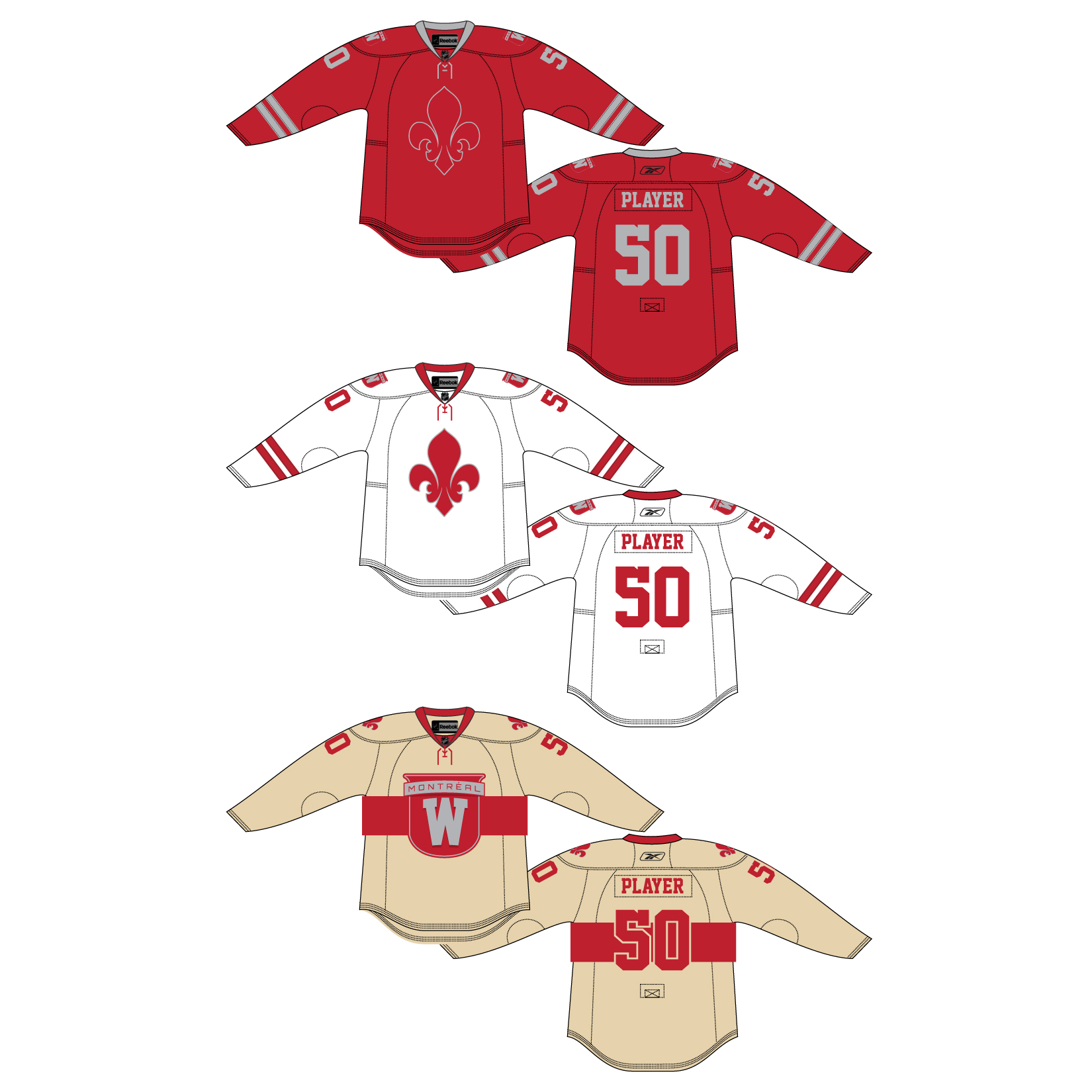
A revitalized logo for the NHL founding member Montreal Wanderers. The Wanderers were four time Stanley Cup champions, but had little success after the NHL was formalized. A fleur-de-lys modified just a bit gives the familiar "W" shape. For the alternate patch, the Canadian interstate sign was used in reference to the Wanderer name, and was meant to mimic the original 1910s logo used by the team. Complete with Home, Away, and "Redband" alternate jerseys.
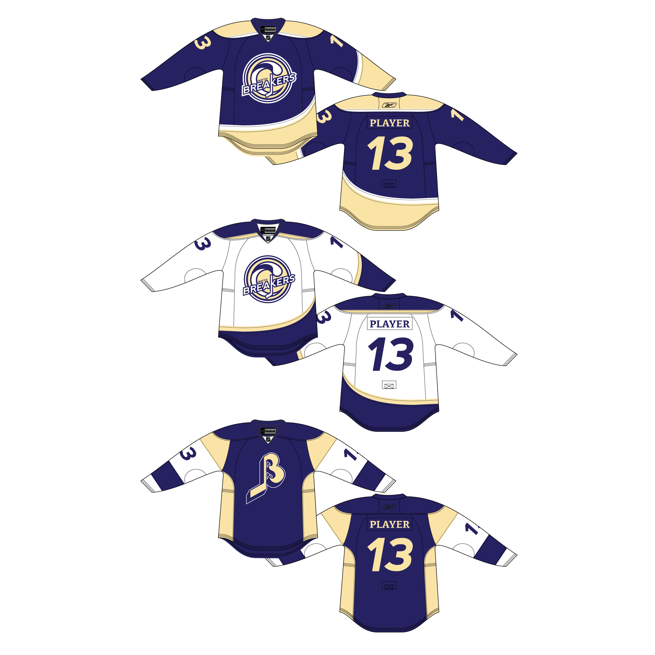
Modernized logo for the old WHL team from Seattle. Using the old Breakers logo as a template, the type needed some attention. The colors were also changed from an overused blue/orange scheme to differentiate from current teams. The alternate logo is a rebuilt version of the second Breakers logo, with new colors and orientation. Home, Away, and alternate jerseys finish off the set.

I have a huge soft spot for the old Canucks "V" sweater that no one seems to care for. This is a modernized tribute to that beautiful (read: hideous) sweater.

The Winter Classic is an outdoor hockey event the NHL has held since 2009. It's been held at such hollowed grounds as the Big House football stadium in Michigan (which incidentally set the NHL attendance record), Ralph Wilson Stadium in Buffalo, and even Fenway Park in Boston. What if, I imagined, the Winter Classic had come to my hometown of Albany?


Proposed logo for the defunct NHL team from Kansas City. Ditching the sensitive Native American imagery, the horse was used as the focal image, but retained the iconic "KC" ligature. The typeface used for he word mark was meant to evoke the ligature.
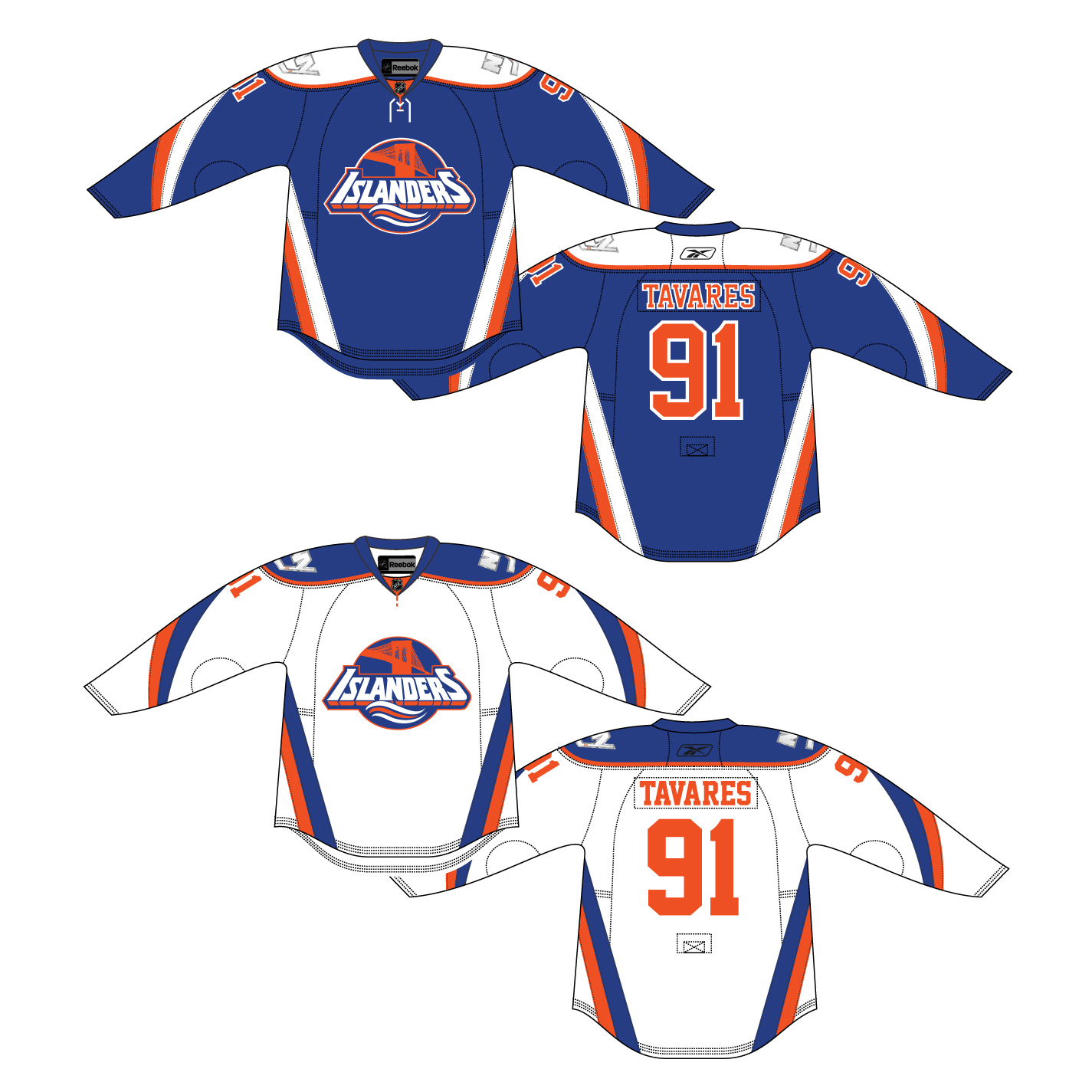
The Islanders made their home in Nassau for the entirety of their 30+ seasons. But with their move to Brooklyn, it seemed like the perfect opportunity to update the franchise, but not stray too far from the familiar.