Idiocracy depicts a terrifying future where the 20th century average man is unfrozen and find himself the smartest man in the world. Everyone in the world from doctors to the president is entirely mindless and advertised too relentlessly. To our benefit, we get to see these ads at length in the film, as well ad the DVD collateral. TriviaHappy sat down with the designer of these ads, Ellen Lampl, and shed some light on the process. It's a great read for those familiar with the film.
Graphic Design is about Solving Problems
I don't think there was one teacher that I had in college that didn't mention something about good graphic design being about solving problems. Making sense of a lot of information in the most efficient way possible is a bit of a textbook way of describing the position, admittedly, but when boiled down to a soundbite, that's what you get.
A friend on Facebook linked to this article, noting his frustration with parking in LA. But I was struck by a few things. The design is great of course, but I also admired the designers gumption to put up a sign herself and get feedback on it. Guerrilla design, without all that sloppy spray paint.
The World Doesn't Read in English
Part of the fun of seeing commercials or ads in foreign countries is to play the “Hey! I understood that!" Game. Catching the Japanese spokesperson try her hardest to pronounce “McDonalds" or seeing the familiar swooshes of the Coca-Cola logo make travel fun, if only to see how the other half 99% of the world lives.
I often forget that many brands are international, and have to adapt when moved to different regions of the world. On top of that, sometimes these area don’t use the same letter set. How can a person in Russia, who reads Cyrillic, possibly understand the title “Transformers"? What good does it do for an English-reader when he sees "ポケットモンスター" on the videogame shelf? That’s where it gets fun. Or hard. Or what have you.
The challenge for the designers of these international brands is to convey the brand they’ve so meticulously created in English to non-English speakers, reading non-Latin characters.
(via Brand New)
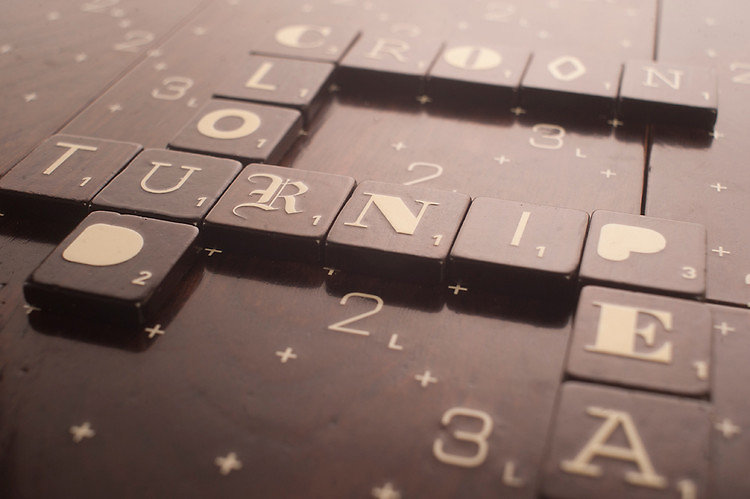
Turnip. 8 points.
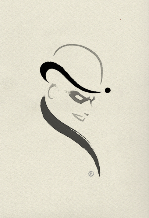
Riddler
ollymoss: Riddler ink doodle from this lunchtime.
The Riddler has always been my favorite Batman villain. That, and anything Olly Moss touches is magic.
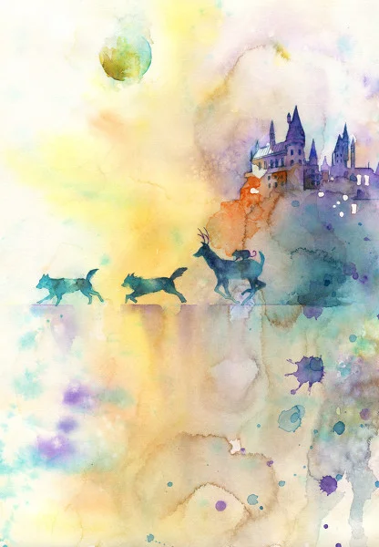
I continue to know nothing of Harry Potter, but appreciate its fans.
I have to start watercoloring again… (via Imgur)
Fade from pink to blue.
(via Creative Review)
Buffaslug
Hockey has been a part of my life for a while now. I grew up playing it, but I was never any good at it. I remember it being very complicated and I didn’t quite understand it all, but I played hard and – hindsight being 20/20 - think I could have been a pretty good player if I had just bothered to learn the rules. Damn you, offsides!
It died out in me for a long time. I would passively pay attention to teams I grew up liking like the Red Wings, the Canadiens, the Leafs, the Sabres… Somewhere along the way I eventually landed on the Bruins as my team, and it wasn’t until they made it to the cup two years ago that I started to sit up and pay attention again.
I’ve written about hockey logos before, even name dropping perhaps my least favorite redesign ever, the Buffalo Sabres. Ugh. The Buffaslug.
* * *
The story isn’t all that dramatic. The Sabres joined the NHL in 1970 with a circle “patch" logo of a charging buffalo above two crossed sabres, all blue, gold, and white. Sabres for the team name, Buffalo for the city in western New York. In 1996, those in charge decided they needed a change, a radical change from the rather plain logo of old. Redefineing the teams color scheme to black and red, a bold new buffalo head logo was the literal face of the teams rebranding. The Sabres were a new team, it said, and this buffalo… he’s pissed.
Original 1970 logo.
1996 logo.
2006 logo, the "Buffaslug."
The logo stuck around for a number of seasons, but never really gained traction. Why I’m not sure, it’s a perfectly fine logo, even ahead of its era, but just ten years later in 2006, the team went after yet another redesign.
This is where my ire and frustration with the redesigned logo lies. The worst kind of redesign is the completely unnecessary one. The black and red head was working well, and was building a certain amount of tradition and esteem. But the team needed another change, a lot happens in ten years. The league was coming out of a season-canceling lockout, and the Sabres needed a new face. Unfortunately, this is the face they got.
Dubiously dubbed the “buffaslug," people plainly did not care for it. The return to blue and gold was welcomed by most, but the form and movement was completely off and struck a terrible tone. It looked bad on the jerseys, it looked bad with type… it just looked bad.
I hated this logo. I would talk about how bad this logo was to anyone who would listen. I still do, just ask anyone who has had the misfortune of bringing up sports logos around me. Suffice it to say, the designer of this logo won no points with me, and I deemed him/her as my mortal enemy. If ever we crossed paths, they would need to be destroyed for unleashing such blasphemy upon the NHL. Nay, the world at large.
In 2010, the team reverted back to the original 1970 logo.
* * *
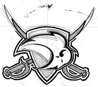
Cut to today, and the reason for this post. I stumbled upon this post from a while back on Chris Creamer’s fantastic website today. The designer of the logo had actually gone into the site’s message boards and had a discussion about the process of the logo (see above concepts).
*gasp* Face to digital face with my mortal design enemy?
As it turns out, the logo was done by designer Kristopher Bazen, fairly early in his professional career. He cited it as the project he learned the most doing:
One thing I learned was that you can’t please everyone, no matter how hard you try. This may come as a surprise to some people, but I actually tried to do a good job on this project! For real, though…I didn’t set out to S#!+ the bed, ya know?
It also made me think about how there needs to be a balance in design, at least for me. I think as artists, we have a tendency to think we know what’s best for the client, and in a lot of ways, we do… I think we can also get caught up in designing for other designers, and alienate clients and normal, everyday fans in the process! I learned to think bigger than myself, to keep the people that were passionate about a franchise in mind throughout the creative process, because they have to live with that mark. I want them to be proud when they wear my marks, ya know?
Also, there is no formula, no recipe, no sure-fire way to know that what you’ll create will be the end all, be all identity that pleases everyone, so just be the best “you" you can be. Be inspired by your peers, forge your own path, and have fun with it. I firmly believe that we can create great work if we work together, be constructive in our criticisms, and push each other positively for the love of the game.
So there you have it. Bazen was not some hot shot who thought this design was amazing. It was the victim of design by committee, and some rookie mistakes. The Buffaslug guy is… actually a human being. Also, it turns out, developed into a really great designer. Live and learn, I suppose. Who knows where Bazen would be without this experience?
(That said, this should have been developed more, Kris! You should have gone ahead with this one!)
World Series
In the spirit of the Olympics and all things video games, these Playstation XMB themes are pretty damn awesome.

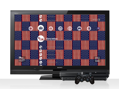
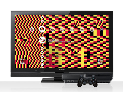
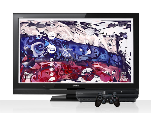
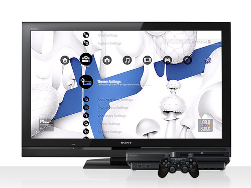
(from The Studio, via Surfstation)
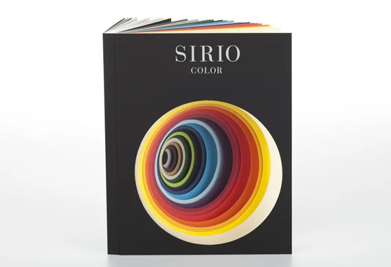
The Very Hungry Catapilar's color book.
(via Creative Review)
4seven
And piggy-backing off the last post, more Channel 4 idents, this for a new channel named 4seven. Still barely there.
(via Brand New)
Channel 4
Gosh, these Channel 4 idents have been around forever, but I’m just seeing them now. Love the “barely there" style. Don’t blink, you’ll miss it.
Ekaterina Koroleva
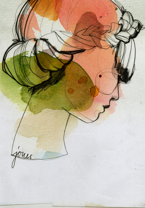
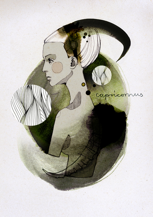
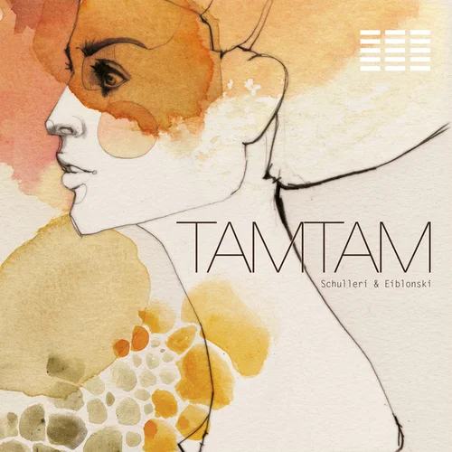
Love these watercolors by illustrator Ekaterina Koroleva. Watercolor has this effect on me…
(via BumBumBum)
Har har.
(via Brand New)
Title Design
(via Kill Screen)
The Sun is Up…
Speaking of that inspiration, a coworker of mine has really been pushing me to do something. “A re-up is fine, " he told me, “but I start to worry after three months." It weighed heavily on my brain, and I was finally pushed today to but down one of the many ideas floating around my head.
(For those wondering, it’s a line from Owen Pallett’s “What Do You Think Will Happen Now?" off the immaculate Heartland.)
Colossal Dumb Valentine
ollymoss: Colossal dumb Valentine
FILDI
Inspiration. It’s a fickle thing. This blog lay mostly barren for the majority of 2012, but let’s make time for it, shall we?
Death Pop
Shake off that holiday slump, we’re back. Mark Hall-Patch did some fancy lettering for some death metal logos, only they’re for pop artists. Oddly enough, I could see Lady GaGa using this one at some point…
(via Buzzfeed)
Times New Lego
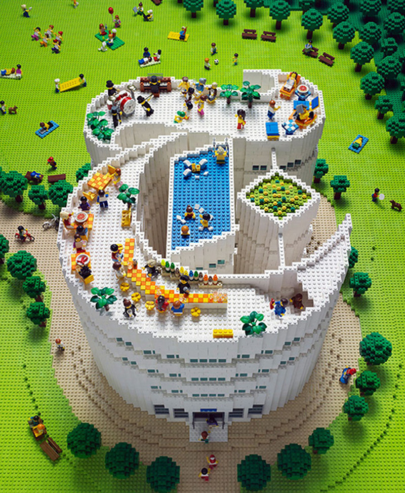
"Lego artist Sachiko Akinaga spent 11 days assembling the cover for the New York Times Style Magazine’s winter travel edition." (via Buzzfeed)
