Hockey has been a part of my life for a while now. I grew up playing it, but I was never any good at it. I remember it being very complicated and I didn’t quite understand it all, but I played hard and – hindsight being 20/20 - think I could have been a pretty good player if I had just bothered to learn the rules. Damn you, offsides!
It died out in me for a long time. I would passively pay attention to teams I grew up liking like the Red Wings, the Canadiens, the Leafs, the Sabres… Somewhere along the way I eventually landed on the Bruins as my team, and it wasn’t until they made it to the cup two years ago that I started to sit up and pay attention again.
I’ve written about hockey logos before, even name dropping perhaps my least favorite redesign ever, the Buffalo Sabres. Ugh. The Buffaslug.
* * *
The story isn’t all that dramatic. The Sabres joined the NHL in 1970 with a circle “patch" logo of a charging buffalo above two crossed sabres, all blue, gold, and white. Sabres for the team name, Buffalo for the city in western New York. In 1996, those in charge decided they needed a change, a radical change from the rather plain logo of old. Redefineing the teams color scheme to black and red, a bold new buffalo head logo was the literal face of the teams rebranding. The Sabres were a new team, it said, and this buffalo… he’s pissed.
Original 1970 logo.
1996 logo.
2006 logo, the "Buffaslug."
The logo stuck around for a number of seasons, but never really gained traction. Why I’m not sure, it’s a perfectly fine logo, even ahead of its era, but just ten years later in 2006, the team went after yet another redesign.
This is where my ire and frustration with the redesigned logo lies. The worst kind of redesign is the completely unnecessary one. The black and red head was working well, and was building a certain amount of tradition and esteem. But the team needed another change, a lot happens in ten years. The league was coming out of a season-canceling lockout, and the Sabres needed a new face. Unfortunately, this is the face they got.
Dubiously dubbed the “buffaslug," people plainly did not care for it. The return to blue and gold was welcomed by most, but the form and movement was completely off and struck a terrible tone. It looked bad on the jerseys, it looked bad with type… it just looked bad.
I hated this logo. I would talk about how bad this logo was to anyone who would listen. I still do, just ask anyone who has had the misfortune of bringing up sports logos around me. Suffice it to say, the designer of this logo won no points with me, and I deemed him/her as my mortal enemy. If ever we crossed paths, they would need to be destroyed for unleashing such blasphemy upon the NHL. Nay, the world at large.
In 2010, the team reverted back to the original 1970 logo.
* * *
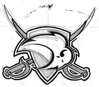
Cut to today, and the reason for this post. I stumbled upon this post from a while back on Chris Creamer’s fantastic website today. The designer of the logo had actually gone into the site’s message boards and had a discussion about the process of the logo (see above concepts).
*gasp* Face to digital face with my mortal design enemy?
As it turns out, the logo was done by designer Kristopher Bazen, fairly early in his professional career. He cited it as the project he learned the most doing:
One thing I learned was that you can’t please everyone, no matter how hard you try. This may come as a surprise to some people, but I actually tried to do a good job on this project! For real, though…I didn’t set out to S#!+ the bed, ya know?
It also made me think about how there needs to be a balance in design, at least for me. I think as artists, we have a tendency to think we know what’s best for the client, and in a lot of ways, we do… I think we can also get caught up in designing for other designers, and alienate clients and normal, everyday fans in the process! I learned to think bigger than myself, to keep the people that were passionate about a franchise in mind throughout the creative process, because they have to live with that mark. I want them to be proud when they wear my marks, ya know?
Also, there is no formula, no recipe, no sure-fire way to know that what you’ll create will be the end all, be all identity that pleases everyone, so just be the best “you" you can be. Be inspired by your peers, forge your own path, and have fun with it. I firmly believe that we can create great work if we work together, be constructive in our criticisms, and push each other positively for the love of the game.
So there you have it. Bazen was not some hot shot who thought this design was amazing. It was the victim of design by committee, and some rookie mistakes. The Buffaslug guy is… actually a human being. Also, it turns out, developed into a really great designer. Live and learn, I suppose. Who knows where Bazen would be without this experience?
(That said, this should have been developed more, Kris! You should have gone ahead with this one!)


