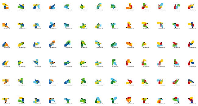
The MIT Media Lab introduced a new logo – or I guess logos… logo system? – recently, that’s really crazy. I’ve seen logos that have permutations on a theme (Nickelodeon’s old identity springs to mind), but this one most assuredly takes the cake.
The overarching idea of the logo is the three variously colored spotlights mixing and coming together, each maintaining it’s own identity, something that speaks to the lab’s tradition of “cross-pollination" as Suzanne Lebarre calles it at Design Co. “The Media Lab has outgrown this notion of traditional media, with researchers working in areas ranging from human computer interaction to neurobiology or nanotechnology,” Richard The, a designer of the logo system, noted. “Whatever ‘media’ means, it has been and will be defined at this place, in the next 5, 10, 20 years. The algorithmic logo is an effort to capture this dynamism.”
The craziest part (and this is what prompted me to tell you guys about it) is that it’s based on an algorithm that can create up to 40,000 unique position/color combinations. That’s enough to give every staff member their own logo. For the next 25 years. They’ve even gone as far as to set up a website where folks can choose their own logo. Once a design has been chosen, no one else can use it. On all of your business cards, tote bags, etc., it’s your personal logo. It’s a wonderful idea, that results in such a bizzarre and beautiful logo.
(via Surfstation)


