Bad kerning is forever…


Bad kerning is forever…
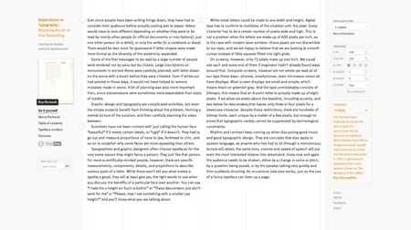
Through the wonders of the internet – you, too, can set type!
Interesting little tool, and the text to go with it. Change the font, change the leading, add drop caps, indents, etc., etc. Learn what goes into laying out text. HOW EXCITED ARE YOU?! (via Surfstation)
“If the way to motivate someone to put their hand in their wallet is by drawing a picture, then draw a thousand.”

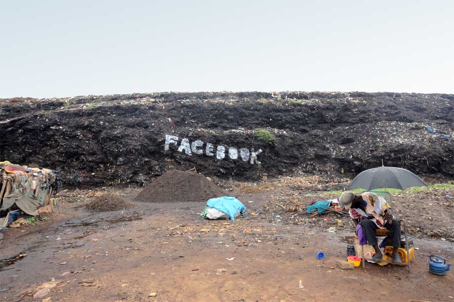
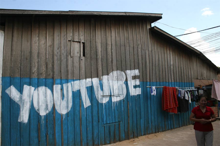
Really interesting series of photos here. Italian photographer Filippo Minelli used third world backdrops to put our social media usage in stark perspective in an ongoing series Contradictions. Minelli puts it best in a 2008 interview, so I won’t muck up the words:
Technologies and the marketing behind them usually push the almost religious aspect of their evolution… and the users are pushed to live in an intense way the abstraction from reality, living technologies only as an idea and sometimes without even knowing their real functions… what I want to do by writing the names of anything connected with the 2.0 life we are living in the slums of the Third World is to point out the gap between the reality we still live in and the ephemeral world of technologies.
(via Flavorwire)

I’ve been wondering this for sometime. They say that tablets and touch interfaces, like the iPad and the new Xoom, are going to be the wave of the future (see Microsoft’s Surface technology), and soon we will all be using touch interfaces. While this has yet to be proven for personal computing, does it hold true for industry professionals like designers?

Smashing Magazine, where the linked article comes from, is an online magazine discussing the more technical aspects of design, often focusing on web design and coding, as well as the way the web is viewed and built on various devices.
Unfortunately, this article addresses nothing about the question posited in it’s title. I was really looking forward to an article addressing the technical aspects of how designers design. I was looking forward to a discussion about how it stands now, including a talk about Adobe’s prospects on the iPhone/iPad.
But what you get is a stylus demo. Should you ever be in the market for one, look up this poorly titled article.
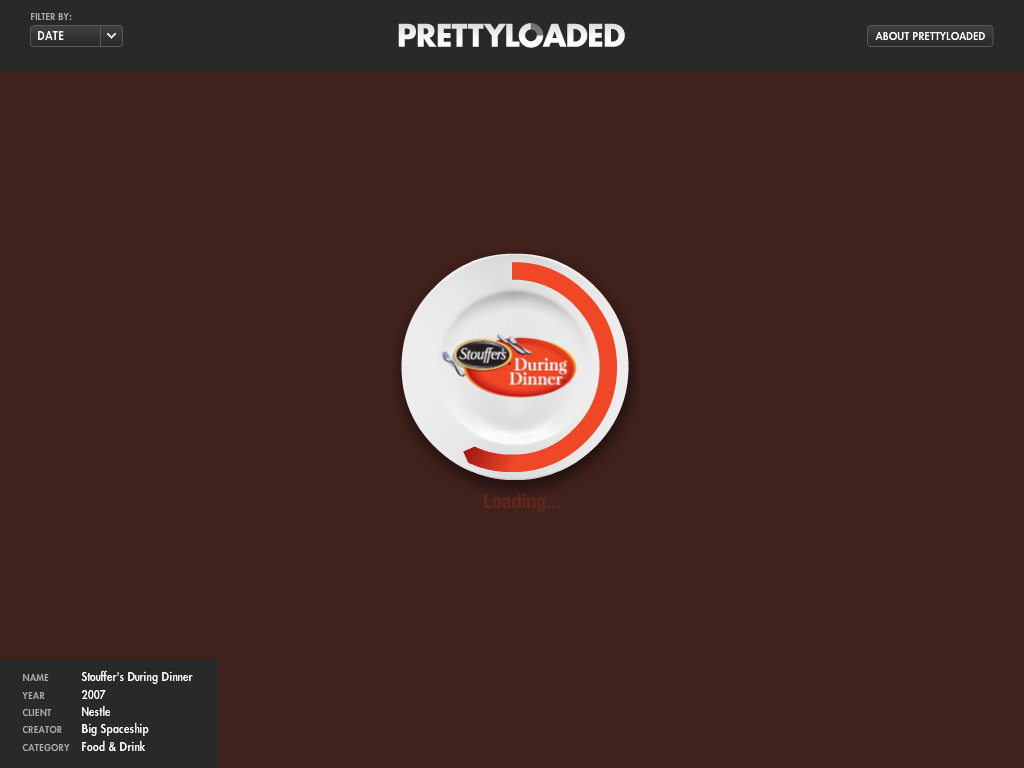
Mesmerizing. Almost philosophical in a way. It’s a website that showcases Flash site preloaders in succession. What is it loading? Will it ever finish? Who knows the answer?
Interesting little note of design on the Daily Show last Thursday; Jon remarks a bit on how well the cover of Stacy Shiff’s “Cleopatra: A Life" is designed.

I love the idea behind this website/book. While it is geared to lawyers, I found it tremendously helpful for anyone needing a guide to make stylish documents, students and laypeople alike. Worth a skimming!
The internet is a-buzz about the new Gap logo.

The new logo was unceremoniously pushed to their website a week or two ago, and the internet hasn’t looked back since. Designers (including myself) and the layman alike have decried the new logo and have made it very public that they kind of don’t care for it. On their Facebook page, a spokesperson has said, in that very special brand of PR speak, that they’re “so excited" that everyone has taken such “passionate" stances on the new logo and are welcoming customer submissions.
While I won’t go into specifics on the merits of the new logo, I wanted to touch briefly on this movement I’ve been seeing on many websites talking about it: that this is a heavily orchestrated PR stunt for the Gap.
I think it’s very cynical to believe that the Gap had deliberately made a bad logo just to then outsource it to the customer. There’s a level of ridiculousness that I just can’t believe a company would allow. While on the one hand, it feels like that idea has some legs: the Gap is positioning itself as a brand of the people, so much so that the people themselves have decided how the brand should look. Customers will see this new user generated logo and think “I did that. I helped the Gap make an important decision. That’s my company."
But that’s just it – a logo should tell the customer what the company is all about, not the other way around. And how would you feel if that was your brand? Who wants a company – especially a fashion brand – that sets a precedent that it is unconfident, that says “Please like us! We’ll do anything!".
I can’t get behind this notion of bad publicity as good publicity. I’m more inclined to believe that this logo was a concept that accidentally got pushed to the website and garnered more attention than the Gap was hoping.
Though as one commenter on the Creative Review blog noted, it seems nothing is sacred in advertising…
I’m a musical person. I used to play the viola (in grade school), I can play some mean Rock Band drums, and I like to think I can sing (alone, in the car, just like everyone else… but I really can! Really!), but usually I let the professionals handle it. I love the discovery of new and amazing music that I can appreciate now or add to my ever growing library of personal favorites. 2010, so far, has been another great year for music, with great albums coming down the pike every day it seems.
CokeMachineGlow, a music blog I sometimes read, used to have a feature about this time each year called Halfstravaganza, where they would look back at the first half of the year as well as look forward to what the year had left to give. I title this in honor of that, but as this is a design blog, I’ll be noting the album covers that have been coming out that catch my eye. Some favorites of my favorite artists:

Surfer Blood - Astro Coast

The Morning Benders - Big Echo

Vampire Weekend - Contra

Dozens - Dozens EP

Phantogram - Eyelid Movies

Jónsi - Go

Owen Pallett - Heartland

The National - High Violet

Tame Impala - Innerspeaker

Gorillaz - Plastic Beach

Beach House - Teen Dream

LCD Soundsystem - This Is Happening
As always, I’d love to hear your thoughts, your favorites. I know of only so much music, and this just plays out as a who’s who of a hipster, Pitchfork music (due largely to the fact that I am that target audience… ahem…). So please, what are your favorite album covers?
This thing is so cool. I know it’s everyday information, but there’s such a beauty behind it. Do you suppose they sell a home model?
(Note: This actually won an award, the 2010 National Design Award for Interaction Design, awarded to Lisa Strausfeld at Pentagram.)
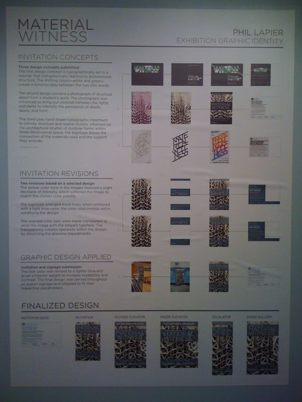
So, I was at the Albany International Airport picking up a friend. I got there rather early, so I decided to explore and… Did you know there’s an art gallery on the third floor? Well, there is. It’s got a great exhibition of sculpture using found materials, but the picture is of a concept and followthrough for the signage design. It was a thesis for design student at a local college. It’s gives a fascinating look at the process taken to get to the final design. The public rarely gets to see sketches and follow the thinking of the designer.
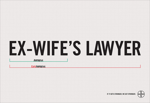
I wanted to share these ads to show how a good concept is often more impressive than any dramatic design work. Especially in advertising, getting the point across quickly is crucial. This campaign makes no bones about it: sometimes normal strength is well enough, but sometimes… sometimes you need that extra strength. “If it gets stronger, we get stronger."


“Good artists copy, great artists steal.”
Full disclosure: I am not a fan of Seattle’s Best Coffee. It doesn’t do much for me, and I feel their ubiquitous presence in Borders’ across the country is, well, weird. Seattle? Why would I want Seattle’s coffee? I’m old and crotchety regarding my coffee it seems. But recently, Seattle’s Best Coffee changed their logo, as companies have a tendency to do.
Changing an established logo is an endeavor that cannot be taken lightly. It is the first introduction you give your customers and it needs to say everything about your company in one mark; it needs to be recognizable, original, and if all goes according to plan, represent where your company stands in the market. Changing this can dramatically change all that, intended or otherwise, for better or for worse.

On the left we have the old logo. On the right, the new. The differences are remarkable, to day the least. It is a drastically modernized logo, continuing with a trend of flatter, less involved logos; I think the Pepsi logo change is the flagship example of this. But where Pepsi succeeded in updating their logo, I think Seattle’s Best’s logo most assuredly didn’t.
Why? Well, for one, it doesn’t look like they sell coffee; if it didn’t say “coffee" in the mark, you would never know. Yahoo! Business reports various opinions on it, one person saying it looks like “Seattle’s Best Blood Bank." It doesn’t feel like coffee much, either. It’s dull and sterile. It reminds me a lot of Target’s Up & Up brand (which, again, does it more successfully), not coffee. The old logo was robust and rich, like coffee. It was bold and warm. Now it’s kind of vague and unfamiliar, not a good ‘first impression’ that I was talking about earlier. Another person from the Yahoo! article quipped that it looks like a “cereal bowl full of tears." A Seattle Times snap poll shows that just over 73% of people think “they should try again."
So what does Seattle’s Best do? I don’t think they’ll do anything. They seem very confidant in their marketing, and as the chain expands this year, we’ll be seeing more and more of this logo. Thoughts?